 I had an early flight out from Las Vegas back to Cincinnati after New Media Expo and the Consumer Electronics Show.
Along the way, I discovered many ways that Delta could have provided a seamlessly enjoyable experience for their customers. Maybe you can do the same with your customers.
1. Make clear instructions
When I arrived at the Delta check-in line, I found one line that spit me into the electronic, self-check-in system, and one line that went to humans. I had already checked myself in, so I needed a human to take my luggage.
Where do I go?
Some simple signage would have gone a long way. “Assisted ticketed or luggage check-in here” would have cleared my confusion, and the confusion of several other customers who had to ask questions.
2. Don't force your customers to waste
I hate paper and I love the convenience of my smartphone. So I choose to use an eboarding pass whenever possible.
Upon checking in my luggage, the ticketing associate proceeded to print my two boarding passes, “in case your battery dies or there's a problem with the scanners.”
At this point, the whole purpose of eboarding passes just died.
Let me worry about my own battery or how my phone works.
If you think there's a possibility of your system failing, fix that before inconveniencing your customers with wasteful “insurance.”
3. Default to convenience
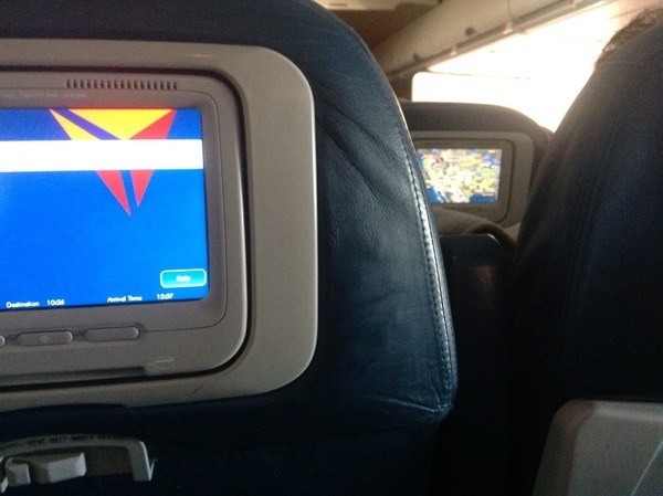
Inside the airplane, every seat faces a small LCD screen for in-flight entertainment, messages, and other purposes.
My flight boarded at 5:20 in the morning and not many people were interested in looking at a glowing screen. Thoughtfully, Delta has a power button below the screen so it can be turned off.
For the first hour, I think I was the only person to recognize the power button and turn off my screen.
You can serve your customers better if your default is convenience. For Delta, I would suggest this being the screens turned off for flights in darkness.
Don't make your customers have to inconvenience themselves in order to receive the convenience.
4. Don't advertise to paying customers
I have a big pet peeve about ads. I welcome ads on free content, because the bills have to be paid somehow.
But if I'm paying for something, I shouldn't have to see ads. (Cable companies and Hulu, this is why you will never receive my dollars.)
I was surprised that after spending hundreds of dollars on my airfare, Delta still showed ads on little LCD screens. These ads were unavoidable and the screens could not be turned off during the ads.
Ironically, the intro to the ads said that the in-flight entertainment was provided by the advertising company. But the in-flight entertainment cost money, too!
If your customers pay you, try not to ask them for more money or force them to see advertising.
5. Use humor
Delta gets points here. Instead of the normal flight-safety presentation by stewardesses, Delta played a video through all of the screens.
Version 1:
http://www.youtube.com/watch?v=noE1YzvfA08
Version 2:
The words of the video were serious, concise, and simple. But the accompanying video contained small bits of humor that made the safety video a delight to watch.
They didn't use too much humor, which would have distracted from the video's important message. Instead, the humor was like a seasoning that added subtle flavor without overpowering the most important part.
If you can make your customers smile, then you're in the right track.